Seven Steps to Designing or Buying a Logo
Great logo design ideas
There are considerations needed in buying a logo that go beyond just looking great. There are many online tools where you can design a logo using clip art. I offer royalty free logo for those who want an inexpensive logo which they don’t need copyrighted. If you want logo ownership it’s best to use a competent graphic designer. The designer often is your point of contact in building a set of marketing materials. You may at times need to contact the original designer.
Seven steps to designing or buying a logo
1. Simple and Clean
What this really means logo needs to be recognizable, and legible from a distance. It should reproduce well at a small size, a large size, on fabric, metal, paper, and online. The logo may go as large as a billboard or as small as a pen. How well it sizes is important. Solid areas of color work better than shaded logos. If you do opt for a logo with shading, make sure you can get a plain black version as well as a colored one. Limit details.
2. Original Design
If you’re serious about your business, you may want to copyright the logo. Hire a graphic designer who will develop your logo from a concept. They should be able to provide the steps needed to arrive at the final design. Be sure that the rights are pass on to you, the client.
If your designer is just showing you a final logo, than you may not be getting an original. There are many logo design packages out there if an original is not needed. To prove the logo is original you will need to have access to the preliminary sketches or how your designer achieved the results. These are usually the revision cycles when working with a professional graphic designer.
3. Group the logo by industry
The logo needs to compare in likeness and style within the industry it’s in. Often clients show me logos of there competitors and want something in that range. This is actually a good stepping off point. If you want a logo for a small organic farm then it should have an organic feel, not something that looks stiff and stale. A high tech medical device manufacturer should have a logo that looks like it stepped out of a lab, with a clean and deliberate lines.
4. Vertical vs. horizontal.
In today’s standards, I would say it’s a safe bet to keep your logo to a horizontal rectangle that is closest to a square. If your logo is unusually horizontal, ask for the logo to be produced as a vertical as well. This will give versatility to where and what the logo is used for. For instance, if you logo is long and horizontal — and you want to buy advertising space that is vertical, such as a hanging banner — the logo would not be very large produced on a vertical format.
5. Vector Format
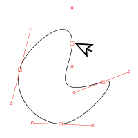
This is the file format need to edit and alter the logo. Printers will need this format to use the logo. Vectors are need to print the logo large and to change the color. At times the lof may need editing, to remove or ad a service mark. Alway get a vector file from your designer along with a jpg and a clear background version such a png.
6. What Does It Say?
Does the logo represent your business? There should be elements that give immediate reference to what it’s representing. This point maybe arguable. If your in the trucking business, it would be logical to put a truck on the logo. This kind of symbolism it not as necessary as one who think. The color and typeface play a role in messaging as well. A trucking business may use a bold typeface with a primary color, but a hair salon may use a wispy typeface with a secondary color.
7. Reproduction
How will the logo reproduce. No just on the web or via email. The logo will be used on all sorts of media. Websites, presentations, email campaigns, brochures, business cards, signage and even t-shirt. The logo needs to reproduce well on all substrate and media.
Want more information about logo design?


