Multi-colored Logo Design
Out of the Grey Area
Creating a Multi-colored Logo
The prevalent use of the multi-colored logo design is the result of web-based marketing and digital printing. There’s no defined parameters on how many colors can be used in a logo. In the past, a multi-colored logo was taboo since offset printing required that colors match exactly from printed piece to printed piece. A color matching system was used to get the logo color to match exactly no matter what substrate it was printed on. However with online communications, there’s no controlling the end-user’s display. Each monitor calibrates colors differently. Which means, a color shift hue, tone, or saturation from screen to screen. Colors on the tablet may not be exactly the same on the desktop. Standardized logo color matching is a moot point.
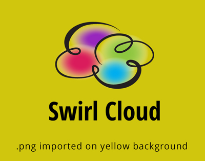
Multi-colored logo design is becoming popular now that marketing materials are easier to publish. The multi-colored cloud logo shown below was developed using transparent colors. If you stare at this long enough you will start to get an op-art effect — where the still image seems to move or vibrate. To see how easy it could be used on various colored backgrounds. A png file was created and placed over a yellow background as seen here.
We often see problems with a logo design when the back ground is part of the design. Where the logo can not be separated from the background or cut out on a different colored background.
In a perfect world, using transparent colors may no be the best solution for all applications so when requesting a logo design — always request a — one color — black and white version from your logo designer.

The logo designer should create a one color versions that is ultimately recognizable and unmistakable for any other design.
This multi-colored cloud logo design is for sale in the Royalty-Free Logo Boutique at Flying Cloud Design Shop.


